    Knowledge

    Understand materials before you decide.

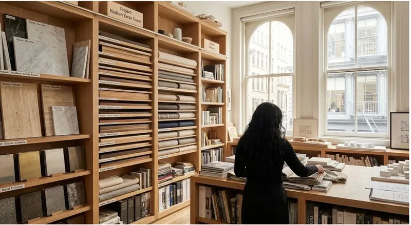
    A material library is only as valuable as the knowledge with which you use it. Here we gather what we learn from our daily work with architecture and design practices. On acoustics, fire protection, natural materials, light and the maintenance of data. Plus: experiences from practice, from architecture studios working with Material Concierge.

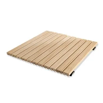
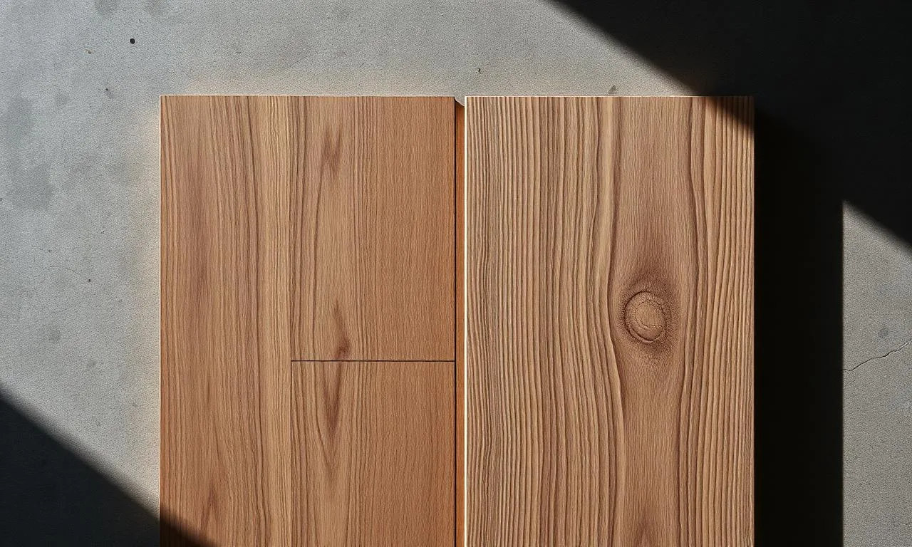
    Two wood samples on a concrete floor with play of light and shadow

    Categories

    Topics from practice.

    Acoustics

    Why acoustics in interiors is not an afterthought

    A beautifully designed room that echoes is a failed room. What architects should know about acoustics before drawing the concept.

    4 minutes read

    Fire protection

    Understanding fire classes: what architects in Switzerland need to know

    B-s1, A2-s1, d0. A technical language that determines the suitability of materials. A brief introduction that is sufficient for everyday use.

    5 minutes read

    Natural materials

    Natural stone, ceramics, wood: when to use what

    Three materials that often feel similar but behave very differently. When natural stone is the right choice, when ceramics, when wood.

    4 minutes read

    Light

    How light brings materials to life

    Every material looks wrong under the wrong light. What architects should know about colour temperature, colour rendering and light direction.

    4 minutes read

    Data management

    What keeps a material library current

    A library is not static. Fire classes change, ranges are revised, availability shifts. What lies behind keeping data up to date.

    3 minutes read

    Natural stone & ceramics

    Stone is not just stone

    Limestone, marble, granite, quartzite, travertine, slate, bluestone and porcelain stoneware: properties, Mohs hardness, care and specification for architects.

    12 minutes read

    Textiles

    Fabric is more than colour

    Weaving techniques, fibres, fire protection, Martindale, acoustics and specification: what architects need to know about wall claddings and upholstery fabrics.

    10 minutes read

    Wood floors

    Select, Natur, Rustikal: what grades really mean

    The grade classifies only the appearance of the timber, not its quality. How the common ladder from Prime to Rustikal is structured, and what architecture practices should pay attention to when specifying.

    7 minutes read

    Wood floors

    Plain sawn, quarter sawn, rift: how the cut makes the floor

    How a trunk is sawn determines the figure, dimensional stability and price of the board. The four sawing patterns from plain sawn to live sawn, and when each is the right specification.

    6 minutes read

    Reviews

    What architecture and design practices say about materials and suppliers.

    Experiences from practice: which materials have stood the test of time, how suppliers respond, what actually works in live projects. Reviewed by architecture practices working with Material Concierge.

    Members only

    AI search agent

    Find the right material, by voice or text.

    Describe what you are looking for: room type, fire class, surface, colour. The search agent searches your library and the master catalogue and delivers specific suggestions.

    Pro members only

    How it works

    Two new ways to find what you need.

    For architects and suppliers

    Experiences that help.

    After using a material or working with a supplier, Material Concierge members can leave a short review. Stars, a brief note, what worked and what did not.

    Reviews are only visible within the MC network. Not public. No marketing.

    Suppliers can respond to reviews and reply directly.

    Available from Pro · CHF 99 / month (Essential: read only)

    For architecture and design practices

    Describe. Find. Decide.

    Instead of browsing catalogues: simply describe what you need.

    "Dark natural stone for a wet area, fire class A1, available in Switzerland."

    The AI search agent searches your own library and the Material Concierge master catalogue simultaneously. It suggests the three most suitable materials, with technical data and direct contact to the supplier.

    Available from Pro · CHF 99 / month

    Acoustics

    Silence is a material.

    4 minutes read

    Acoustics is addressed at the end of many projects. When the walls are up, the floor is laid and the furniture is arriving. Then it becomes apparent that the room echoes. Then it gets retrofitted. With visible panels that were never part of the design.

    This is avoidable.

    What acoustics actually is.

    Acoustics describes how sound behaves in a room. How long it reverberates, how it is reflected, how it is absorbed. This depends on the surfaces. On the geometry. On the materials.

    Hard, smooth surfaces such as concrete, glass or natural stone reflect sound. Soft, porous surfaces such as textiles, wood wool or specialist acoustic plasters absorb it. Most rooms combine both. The question is in what ratio.

    Reverberation time.

    The most important value in room acoustics is the reverberation time. It measures how long sound remains in a room after the source has gone silent. For a living room the ideal values are 0.4 to 0.6 seconds. For a restaurant 0.6 to 0.9. For a concert hall, depending on the music, 1.5 to 2.2.

    When the reverberation time is too high, speech becomes unintelligible. Voices overlap. The effort of listening increases. In hotels this leads to poor reviews, without guests being able to identify the cause.

    How to account for it in the design.

    Three approaches that have proven themselves in practice.

    First: plan soft surfaces before they become necessary. Curtains, rugs, upholstered furniture. They are rarely neutral in the design, but they work doubly: functionally and aesthetically.

    Second: specialist acoustic materials as part of the architecture. Acoustic plasters, perforated wood panels, micro-perforated fabric cladding. They can be integrated without being recognisable as acoustic solutions.

    Third: use geometry. Non-parallel walls, vaulted ceilings, offsets. They scatter sound rather than reflecting it directly back. This reduces echo effects without additional materials.

    What we see in our libraries.

    In the sample rooms we digitise, we often find a gap between visual material variety and acoustic information. Fabrics are catalogued by colour, weave, care instructions. But rarely by sound absorption class. Wood panels by surface, grain, fixing. But rarely by perforation and acoustic effect.

    This information exists with the manufacturer. It is rarely passed on because it is rarely asked for. Those who incorporate acoustics early in the design request this information and document it. Then it is available for the next project.

    Fire protection

    What the classes really mean.

    5 minutes read

    In Switzerland the fire protection ordinance of the Association of Cantonal Fire Insurance Companies, the VKF, applies. It prescribes which materials may be used where. In residential buildings, in public spaces, in high-rise buildings, in escape routes. The rules are clear. The language is not always.

    The two systems.

    Two classification systems are currently in use in Switzerland. The old VKF system with RF1, RF2, RF3, RF4 and the European system according to EN 13501-1 with classes such as A1, A2, B, C, D, E, F.

    The VKF accepts both, but has switched to the European system for most applications. Those specifying today should work with the European classes.

    What the European classes indicate.

    The main class describes fire behaviour.

    A1 is non-combustible. Concrete, stone, steel, mineral plasters.

    A2 is non-combustible with a limited combustible component. Plasterboard, some mineral wools.

    B is flame-retardant. High-quality wood-based panels, some plastics.

    C, D, E are increasingly combustible.

    F has no requirement for fire behaviour.

    In addition, two further letters are used.

    s stands for Smoke. s1 little smoke, s2 medium, s3 a lot.

    d stands for Drops. d0 no burning droplets, d1 limited, d2 no requirement.

    A complete classification looks like B-s1, d0. Flame-retardant, little smoke development, no burning droplets.

    What is required where.

    In escape routes and public spaces A2-s1, d0 is generally required. In dwellings the requirements are usually lower: B-s2, d0 is often sufficient. In high-rise buildings above a certain height stricter rules apply.

    The exact requirements are set out in the VKF fire protection directive. When in doubt: consult the responsible fire protection specialist.

    What matters when specifying.

    Three points that regularly cause delays.

    First: the certificate must be current. Fire classifications are re-certified every few years. A material that was certified B-s1 ten years ago is not automatically still so today.

    Second: the classification applies to the tested construction. A wood panel tested in isolation has a different classification from the same panel on a combustible substrate.

    Third: the classification applies to the specific product. A variant of the same collection added after certification is not automatically co-certified.

    Working with current, structured data avoids disputes with clients, lead planners and the fire protection authority.

    Natural materials

    Three properties that matter.

    4 minutes read

    The same question recurs again and again when choosing materials for high-quality interiors. Natural stone, ceramics or wood. Visually they can look alike. Functionally they are worlds apart.

    Natural stone.

    Natural stone is material from the mountain. Granite, marble, limestone, slate. Every slab is different. Veining, colour gradients, small inclusions. That is its appeal and its challenge. Those who order natural stone slabs see the result only when they are delivered.

    Natural stone is cold to the touch, heavy in weight, hard underfoot. Marble is acid-sensitive. Limestone is pressure-sensitive. Granite is scratch-resistant, but often reads as industrial. Slate splits but cannot be polished.

    In bathrooms marble works visually. Functionally it is delicate. Lemon juice leaves marks. In kitchens granite is pragmatic, but rarely has the haptic quality of stone that carries a room. Natural stone suits spaces where durability is valued over maintenance convenience.

    Ceramics.

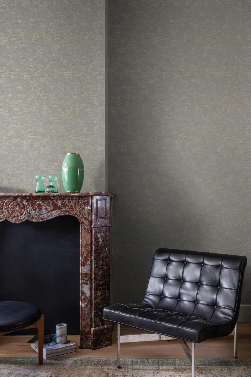
    Ceramics is fired clay, often glazed, and today also available as large-format porcelain stoneware panels measuring two by three metres. It can imitate any surface. Floorboards, marble slabs, concrete, fabric. The imitation has become so good that many clients can no longer distinguish it from the original.

    Functionally, porcelain stoneware is the technically superior material for floors in use spaces. Scratch-resistant, stain-resistant, frost-proof, acid-resistant, easy to maintain. In bathrooms and kitchens it is hard to beat.

    What is missing is haptic depth. Ceramics feels like what it is. Even when it looks like wood. Those who accept this have a material that lasts for decades. Those who do not should choose the original.

    Wood.

    Wood is alive. It moves with moisture, shrinks in the dry, changes colour over the years. Oak darkens. Cherry becomes more reddish. Walnut loses contrast over time.

    This change is not a defect but character. Those who choose wood accept that the floor will look different in ten years than on the day it was laid. Those who see this as a problem should choose ceramics.

    Wood needs care. Oiled wood monthly. Waxed regularly. Lacquered less so, but with consequences if the seal is damaged. In bathrooms wood is possible but delicate. In kitchens it is a matter of discipline.

    When to use what.

    Natural stone in entrance areas, bathrooms with high demands and spaces where durability is valued above maintenance.

    Ceramics in heavily used areas, kitchens and bathrooms where functionality takes precedence over authenticity.

    Wood in living rooms, bedrooms and wherever warmth and vitality should define the character.

    The most important rule: do not choose the material, but understand the room that will contain it.

    Light

    Light is the most important material.

    4 minutes read

    Architects spend hours selecting wall colours, floor finishes, upholstery fabrics. Then light is often addressed at the end. With the result that the carefully chosen materials lose their effect under the wrong light.

    Colour temperature.

    The colour temperature of a light is measured in Kelvin. Low values, from 2200K, are warm and yellowish. Like an old-style incandescent bulb. Higher values, from 4000K, are neutral. Very high values, from 6000K, are cool and bluish.

    Warm lights make warm materials glow. Wood looks lively. Natural stone in beige tones looks natural. But cool materials appear dull. Grey concrete looks tired, bluish fabrics lose their clarity.

    Cool lights are the opposite. They bring out cool materials but make warm colours look pale.

    In living spaces 2700K to 3000K is common. In workspaces 3500K to 4000K. In galleries and for material assessment 5000K to 6500K, because a neutral perception is desired there.

    Colour rendering.

    The colour rendering of a light is described by the CRI value, from 0 to 100. Daylight has a CRI of 100. It shows all colours as they are.

    Artificial light falls below this. A budget LED has a CRI of 80, which is acceptable for living spaces. A high-quality LED reaches 90 or more, which is necessary for spaces where materials need to be shown. Galleries, showrooms and clothing stores work with CRI 95 or higher.

    With a low CRI, materials lose their depth. Red woods look brown. Green fabrics look greyish. Marble looks plastic. Those who specify materials without knowing the CRI of the light risk disappointment with the client.

    Light direction.

    How light falls on a surface determines how the surface reads. Raking light, arriving almost parallel to the surface, emphasises every texture. Natural stone appears more three-dimensional with raking light. Wood grain becomes visible. Plaster shows its texture.

    Direct frontal light does the opposite. It flattens. A rough wall looks smooth. A natural grain disappears. Those who choose materials for their haptic quality should plan the light so that this quality remains visible.

    How we document it in the library.

    In the Material Concierge libraries we record for every sample how it looks under standardised light. That is not the whole story, but a start. Those comparing materials should assess them under the light that will be used in the finished room. Otherwise the result will not match at the end.

    Data management

    A library in motion.

    3 minutes read

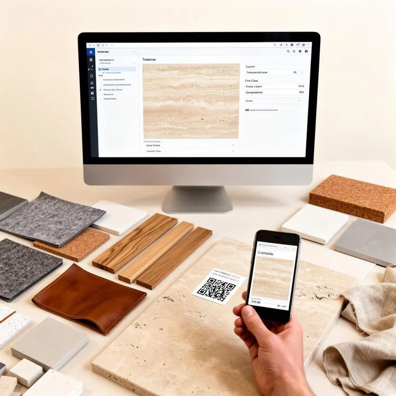
    A material library looks static. Shelves of samples, each in its place, each with its data. But the reality behind it moves. Manufacturers revise ranges, fire classes are re-certified, products are replaced or discontinued. Working with outdated data risks specifications that fail at tender stage.

    What changes.

    Three data types change particularly frequently.

    Availability. Materials go out of the range, new ones are added. For natural materials, sources change as quarries are exhausted or new ones are opened. For industrial materials, collections are revised every few years.

    Certificates. Fire protection classes are time-limited. Five to ten years is common. When the certificate expires, the material must be re-tested, often with slightly different results. A B-s1, d0 classification can become B-s2, d0 after re-certification. That is not a deterioration of the material, but a consequence of today's more rigorous test methods.

    Prices. Prices are not the most important thing, but they change. For natural materials they are driven by raw material costs, for industrial materials by production costs. A specification based on a price from two years ago can lead to surprises at tender.

    How to keep a library current.

    There are three approaches.

    The first is passive. The library stays as it is, and the practice checks individually at each specification. For every question about a fire class, every question about availability, every price enquiry. This is labour-intensive and prone to error.

    The second is semi-active. The practice maintains its library itself, regularly asking suppliers for updates. Quality depends on how systematically the maintenance is carried out. In practice the effort tends to drop off as other tasks take priority.

    The third is systematic. Maintenance is part of a service. A provider, in our case Material Concierge, keeps the data current, checks it for plausibility, updates certificates. The information comes from the suppliers and is bundled in one place.

    Why it matters in practice.

    Working with outdated fire classes in a tender means specifying, having it checked, correcting it, re-specifying. That costs days. In unfavourable cases, weeks.

    A current library shortens this cycle to minutes. The specification is in place, the data is correct, the project moves forward.

    That is the difference between a library that is organised and one that actively works with you.

    Natural stone & ceramics

    Understanding stone.

    12 minutes read

    Natural stone is one of the oldest building materials known to humanity, and remains one of the most versatile. Architects who specify stone make decisions about hardness, porosity, acid resistance, frost behaviour and aesthetic effect.

    This knowledge article summarises the most important stone types used in construction and interior architecture. For the full version: thematerialconcierge.com/en/knowledge/natural-stone

    Textiles

    Understanding fabric.

    10 minutes read

    Textiles in interiors are not decoration. They are acoustically effective, define atmosphere, regulate light and determine how a room feels.

    Weaving technique, fibre composition, fire protection class and Martindale value, for the full overview: thematerialconcierge.com/en/knowledge/textiles

    Wood floors

    The same oak, three faces.

    7 minutes read

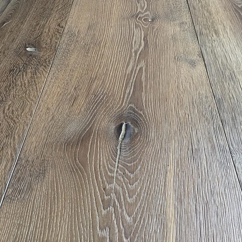
    Select, Natur, Rustikal: few terms cause more confusion when choosing a wood floor than the grade. Two boards from the same trunk can end up in different grades, and two floors with the same grade name can look completely different.

    The grade classifies solely the appearance: knots, sapwood, cracks, colour play. It says nothing about hardness, dimensional stability or lifespan. A rustic floor is not an inferior floor, but the same tree with more visible biography.

    For the full ladder with millimetre limits, standards and a practical checklist: thematerialconcierge.com/en/knowledge/wood-grades

    Wood floors

    The cut makes the floor.

    6 minutes read

    Before a board has a grade, it was sawn. And how it was sawn decides almost everything you later see and feel: the figure of the grain, the dimensional stability, the yield from the trunk, and with it the price.

    Plain sawn gives the lively cathedral figure, quarter sawn calm stripes with medullary rays, rift the most linear picture of all, live sawn all three in one board. Anyone planning wide boards or underfloor heating specifies standing annual rings.

    For all four sawing patterns with diagram and practical rules: thematerialconcierge.com/en/knowledge/sawing-patterns

    More from practice

    Practical knowledge from live projects.

    The topics here grow with the questions that reach us from working with architecture and design practices. If you are missing a topic or would like to see an aspect explored in more depth, write to us.

    Request a conversation →